Magic: The Gathering Arena recently updated the user experience by introducing a few quality-of-life features.
MTGA continues to improve every month. This month’s update brought new cards through the Historic Anthology II and Secret Lair Thalia: Beyond The Helvault that got players excited, but also a bunch of smaller updates that shouldn’t be overlooked.
Direct messaging
That’s right, we can now chat! Unlike Hearthstone, this function will work during gameplay as well, but like Hearthstone, you’ll be only able to talk to people in your Friends list.
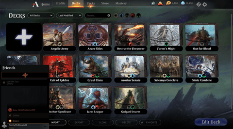
The feature will also have the option to set a status. Busy will stop notifications but will allow you to use the chat functionality while Offline will do just what the name suggests – disable the social features.
Friend challenges will now count towards completing quests
Or at least until the next update in 10 days or so. Challenging a friend won’t count towards your Daily and Weekly wins but will complete all other quests (such as destroying creatures and playing spells of certain colors.)
This feature will disappear in the April update, so grind up your rewards while you can.
Color Challenges introduced for new players
MTGA also has a new and improved tutorial. Wizards are getting rid of the old Account Mastery system in favor of five Color Challenges allowing players to win cards for their first decks.
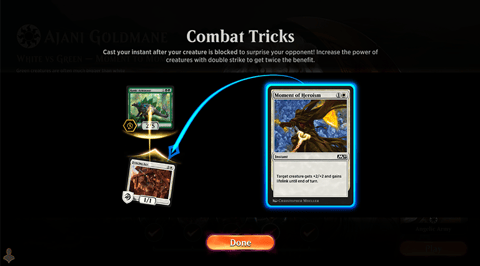
In every Color Challenge, you’ll have to win a game and if you lose, you’ll get an explainer of your cards so you can learn from your mistakes. Pretty good.
If you’re not new, you can still go through the new system if you feel like having a refresher course on the basics.
Card sleeve gallery
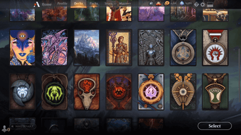
Finally, the ever-increasing collection of Sleeves, the cosmetic card back that could be unlocked or purchased in-game, now works much better.
Instead of the old awkward carousel, the sleeves will now be displayed in a scrollable menu in all their glory.
So, what do you think of the new changes? What other features would you like to see in MGTA? And if you’re new to Magic, here is an awesome starter deck build to get you going!

