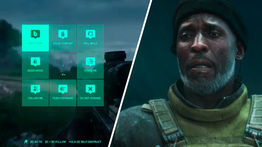
Battlefield 2042's full UI has been leaked on Reddit. Unlike the beta, we now have far more ways to communicate with each other. But is it too much?

A Reddit user has shared footage of the full Battlefield 2042 user interface ahead of the game's release. Unlike the beta, it shows extensive options for squad communication. Ordinarily, you might presume that was a good thing. But this being Battlefield 2042, almost anything is potentially divisive.
The Battlefield 2042 User Interface
Unlike the beta, the full release of Battlefield 2042 will have an extensive communication system. You open up a menu with eight options, and each option will then take you to a sub-menu where you can pick more precisely what you want to communicate. Take a look for yourself:
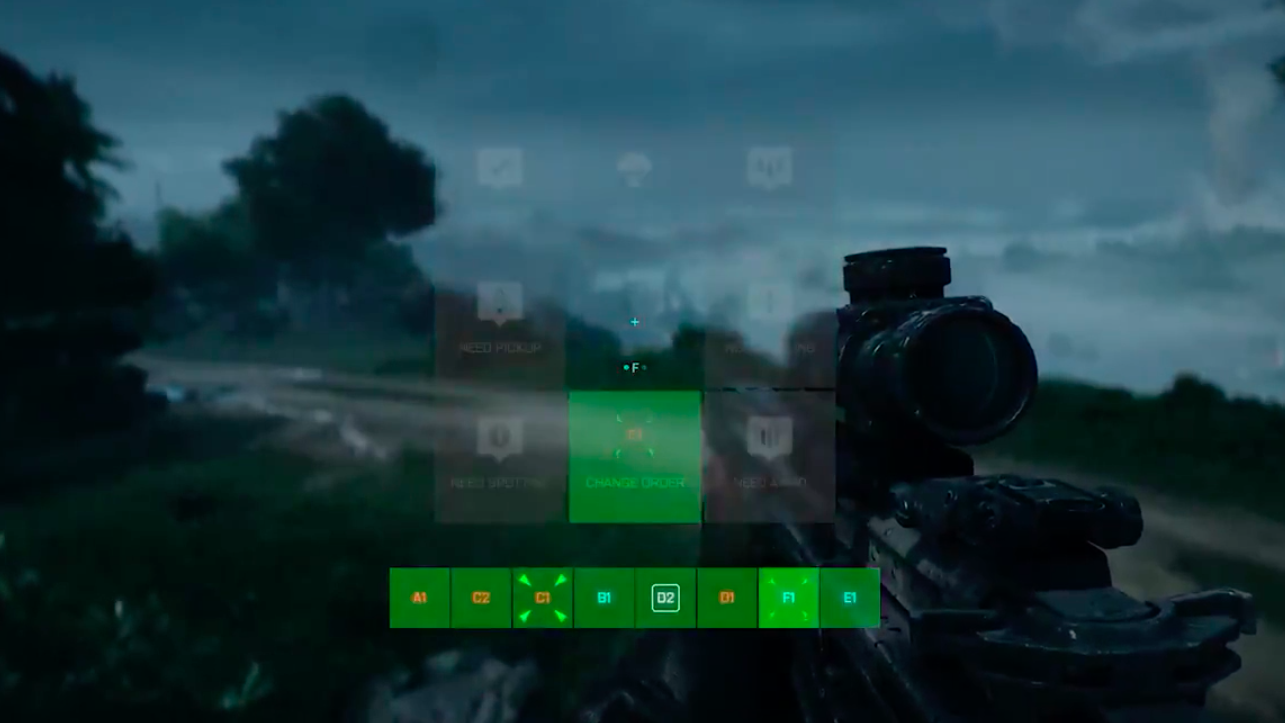
Obviously, this is better than being unable to communicate - it promotes a sense of team comradery that's essential in a Battlefield game. And on PC, this will be absolutely no problem to use quickly and efficiently. Sure, a wheel might have been intuitive than blocks, but it's keeping with the art style of the game. The problem is when it comes to console; how quickly could someone navigate these menus with a controller?
How Have The Fans Reacted?
Some fans love the look of this new UI. The Reddit user who first shared this footage was clearly excited about the new look, and titled the post: "Full Release will be so much different from the beta". And others in the comments agreed that this was a much-needed upgrade from the beta. But the most upvoted comment?
We'll see how popular it is when people can actually use it and play with it themselves. It does look a little complicated, but we're going to hold off on judgment for now.


