The next patch will not only bring us new skins, bug fixes, and all of the stuff we usually get, but will also be a full refresh for the in-game user interface. Let's dig a little deeper into the details!
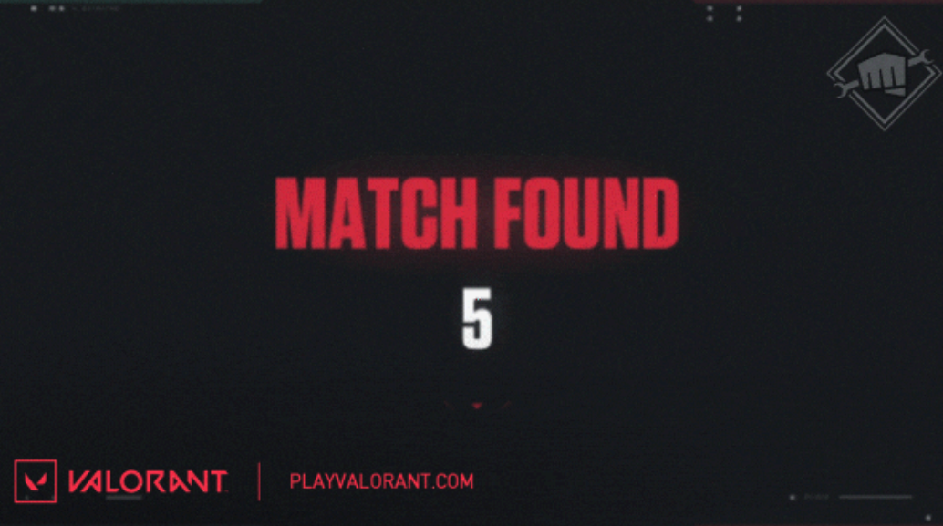
Riot Games has officially announced that in Patch 5.08, which will be the last update in the current Act, we will get a re-design of the entire interface in Valorant. Moreover, it is also likely caused by two things:
As we know, the main goal of the Valorant development team this year was to "strengthen the game's foundation," and this whole re-design thing suggest that this process kind of continues. Let's see what the new user interface version will look like!
Valorant's New UI
The design changes for the entire interface were announced in an official blog post on playvalorant.com. The design changes for the entire game interface were announced in an official blog post on Valorant's official website. And as you can read in it, the main plan of Riot Games designers was to "bring together visually rich interfaces to unify the game and marketing visual identities". Here are some of the visual changes you can expect in Patch 5.08:
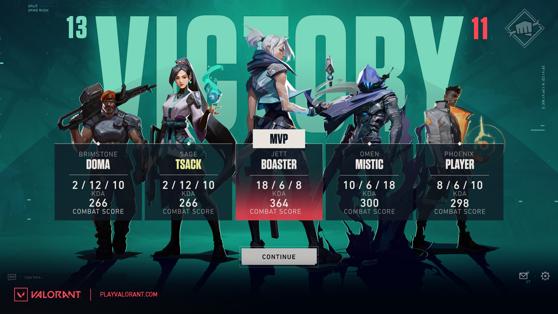
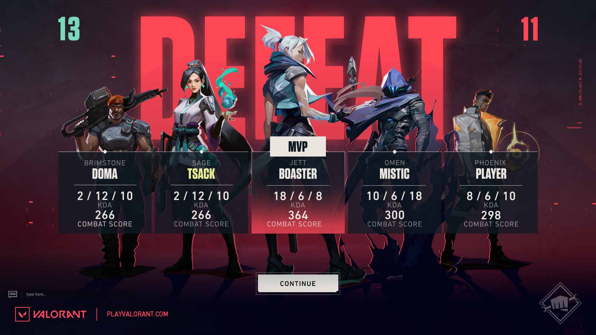
We want you to understand the importance of the team aspect of VALORANT. This new, bold team shot helps to show off your team's MVP and your team composition while reinforcing the emotional narrative coming out of your most recent game—win or lose. We also hope this helps you appreciate the beauty of our Agent visuals with a focus on continuity into the end of game screens (source)
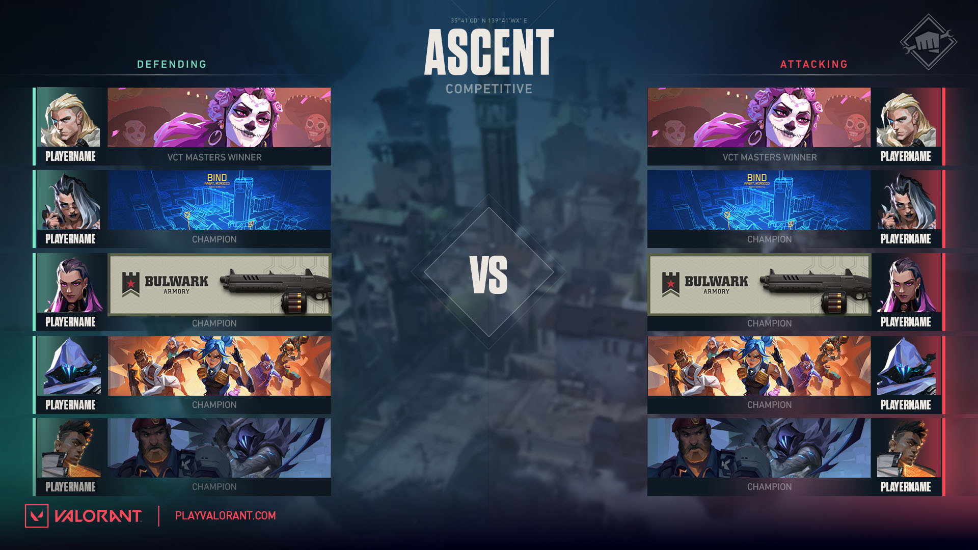
We want the faceoff screen to be all about the two teams about to duke it out. We removed the map so your banners could take up the screen, better showing off your identity through your chosen Player Cards, Titles and Rank badges. We punched up both side's colors, mirrored banner layouts for symmetry, and added ‘VS’ text to emphasize the head-to-head feeling (source)
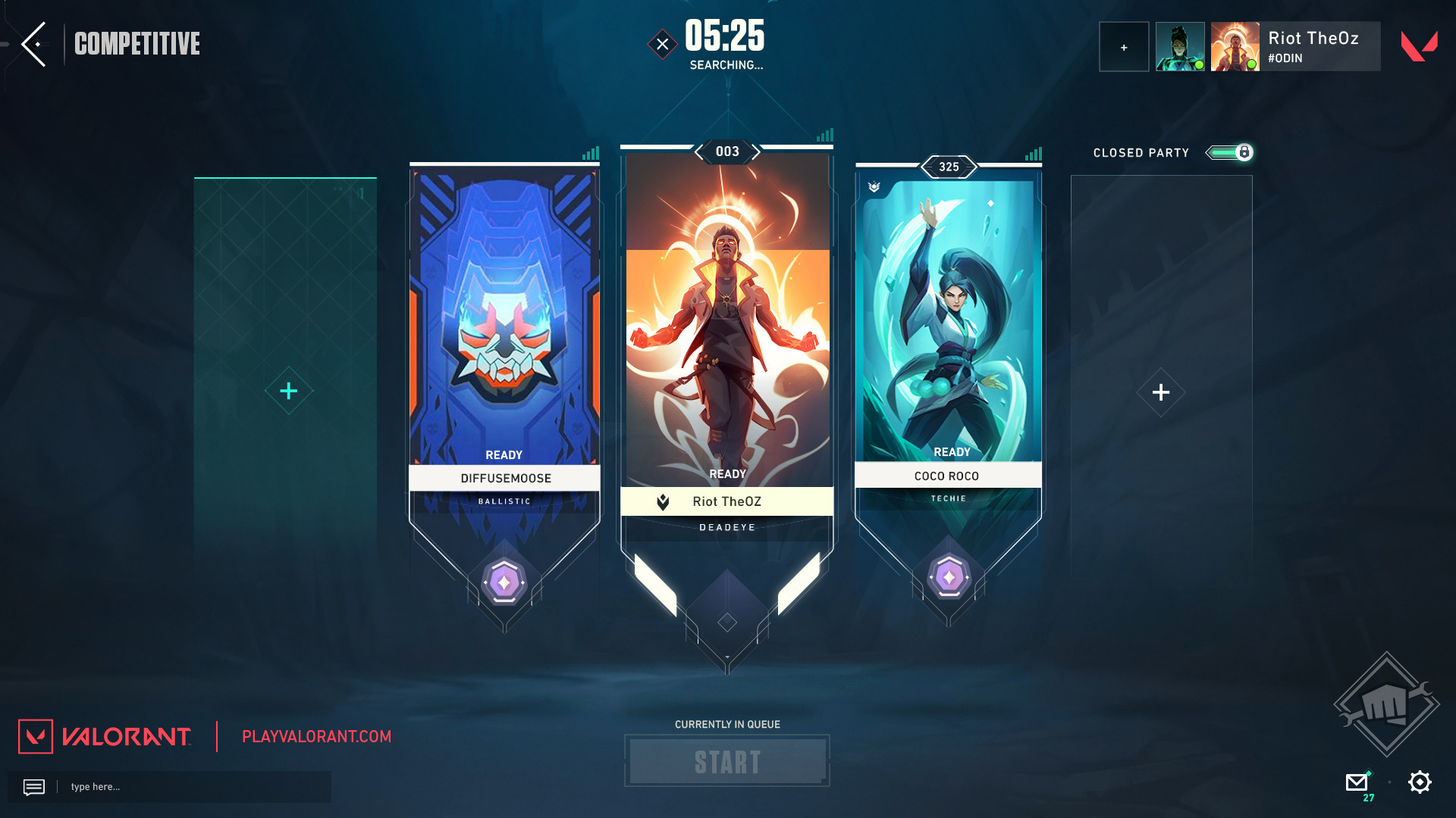
We wanted to remove a lot of visual clutter and improve the overall readability of the Lobby Screen. We had a lot of decoration elements that were pretty but didn't really serve a purpose. In order to emphasize the Playercard and its representation. And to give you a clear ‘call to action,’ we increased the screen’s contrast, pushed color values, and simplified our shape language (source)
All these changes are likely to kick in on Tuesday, October 18, along with Patch 5.08 and Episode 5 Act 3. Are you excited for them? Or you won't accept it without seeing a Chamber nerf? Let's chat about it on our Discord server!
More Valorant:
