The first proper trailer for the remake of the much-beloved stealth action game Metal Gear Solid 3 looks undeniably impressive, but long-time fans are concerned about the game's art direction.
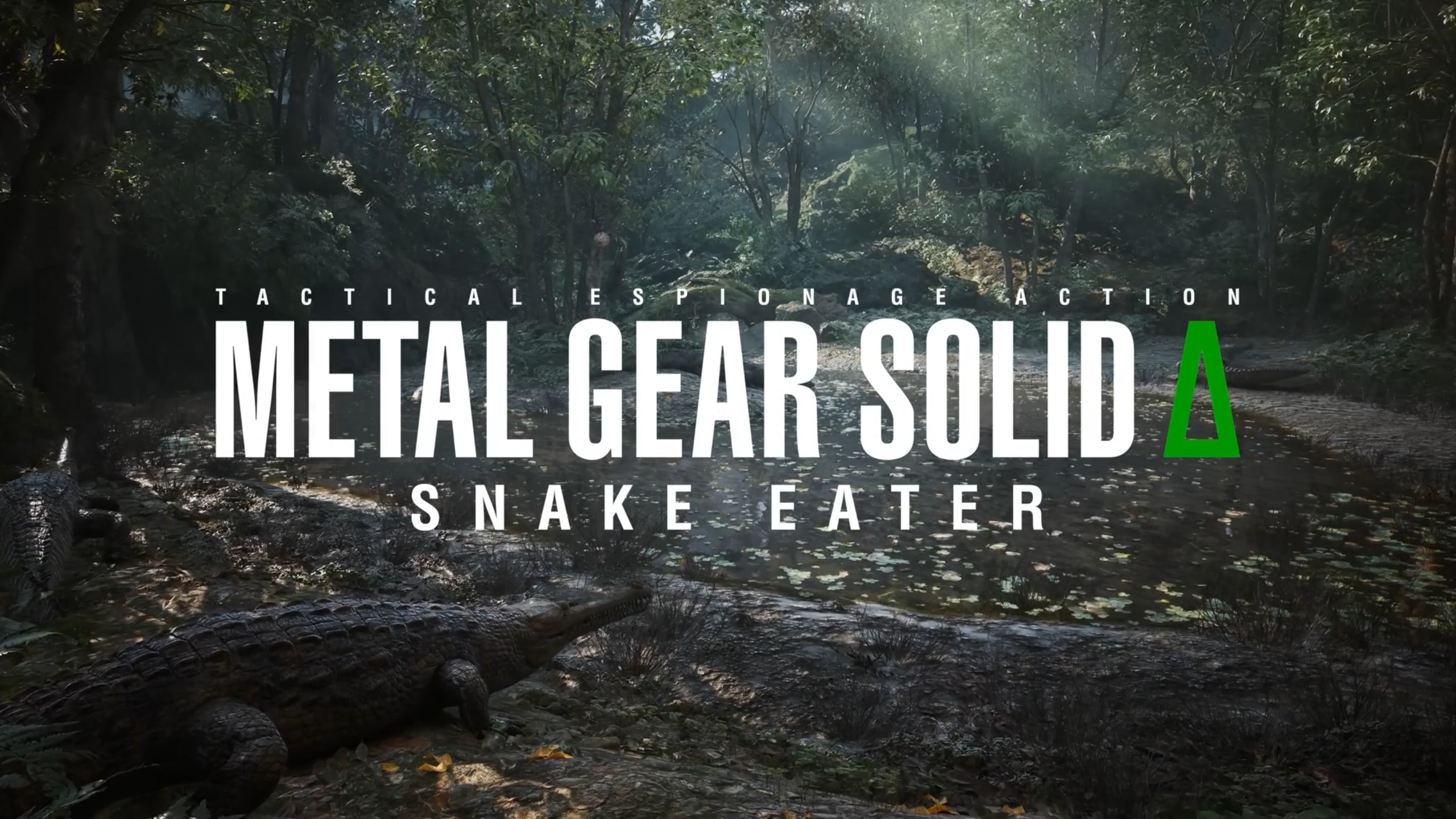
Is it time for a realism vs. art direction debate again? I think it's time for a realism vs. art direction debate again. Our subject this time is Metal Gear Solid Δ (A? Triangle? Delta? Probably Delta), a full remake of Metal Gear Solid 3, which we just got a first proper look of via a new in-engine trailer.
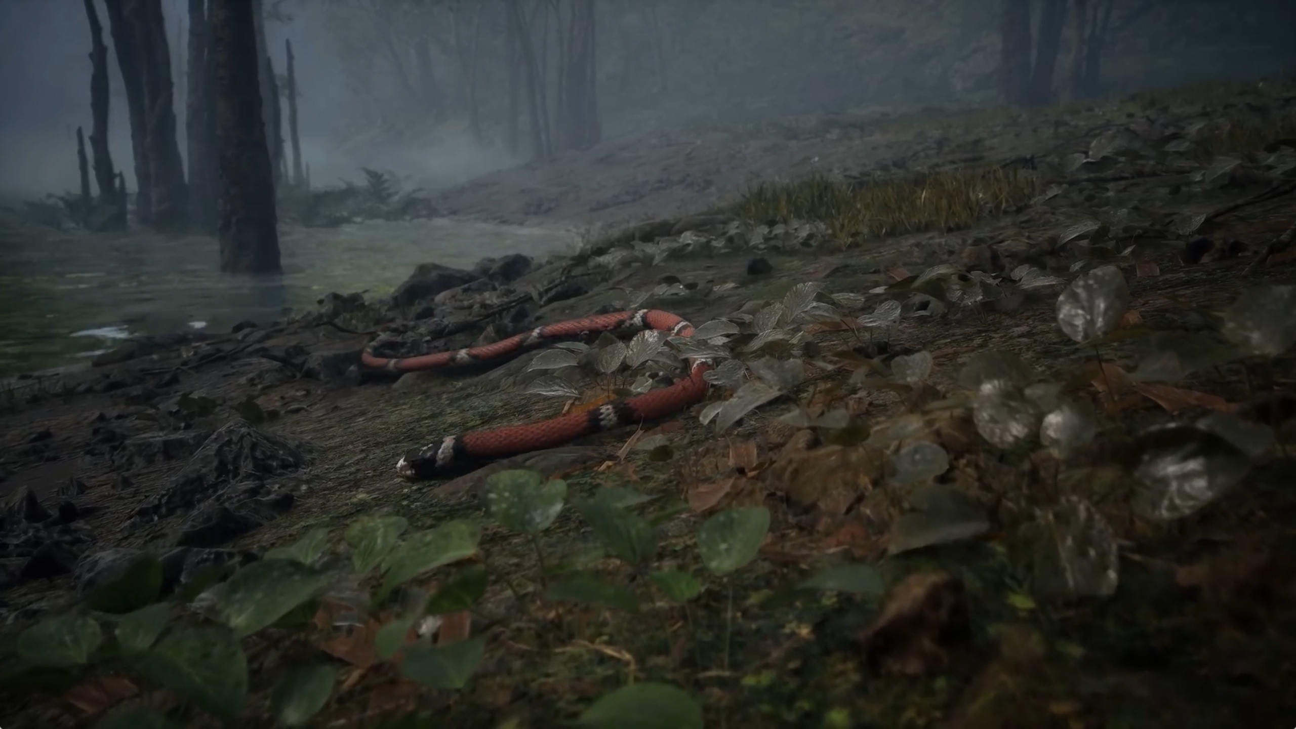
And it certainly looks gorgeous! Naked Snake's mud-caked mutton chops have never had this much visual fidelity before. But doesn't it all look just a bit too clean and clear and true-to-life? Some fans seem to think so, at least. Have a look yourself:
Naturally, MGS veterans have already dissected every frame of this trailer. While it doesn't show any cutscenes one could directly compare with the original, it does show some familiar areas, such as the particularly memorable suspension bridge early on in the game.
There are already side-by-side comparison shots making the rounds on social media, and a not-insignificant portion of players are not happy with how the remake side looks.
Metal Gear Solid 3 vs Metal Gear Solid Delta: Shot for Shot pic.twitter.com/pUVxyXykbE
— IGN (@IGN) October 27, 2023
Metal Gear Solid 3 Remake: Is It Not Yellow Enough?
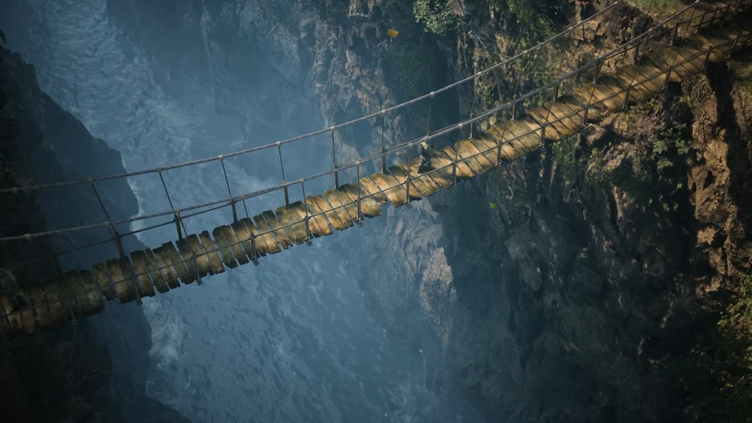
The loudest critics among them point out that the lighting and colors in the trailer are actually too realistic, in their opinion. The original game had some pretty strong color grading and post-processing going on most of the time; This was likely done to make the PS2 game look better for its time.
However, some fans also interpret it as a conscious stylistic choice to complement the game's setting and time period. For example, they think that the jungle areas' yellowish color filters and blur effects were meant to make them look warm, humid and disorienting. Meanwhile, the remake, they argue, is true to life to a fault, robbing the game of the original developers' artistic intent.
if you're going "I don't really understand what the piss filter would look like in modern graphics," let me show you what I think kojima was doing:he's imitating vittorio storaro's cinematography in apocalypse now, but the jungle feels cold, rather than warm and hazy https://t.co/li3IIb4wK4 pic.twitter.com/9yE813kvAB
— doctober (@docsquiddy) October 25, 2023
Now, I have to admit, I've let the critics convince me a bit here. The original game's cutscenes remind me of an older military drama, while the remake gives me more of a nature documentary vibe. Noticeable color grading in videogames gets a lot of flak these days (mostly because of its excessive use during the PS3/X360 era), but I think MGS3 is one game that is still definitely better off with it.
Metal Gear Solid Delta is also set to release on PC, so I'm sure modders will be able to reimplement at least some of the original's visual effects and make both sides of the debate happy. Though the PC port might have its own issues, if the Master Collection is anything to go off of.
How do you feel about the new trailer? Do you like it as is, or do you think it could use another turn at the RGB wheel?
